PICTURE THIS: How Using Graphics Can Boost your Proposal Score
Aug 19, 2021
Using great graphics can elevate your proposal score by engaging your evaluators instead of overwhelming them!
You've heard the old adage, “A picture is worth a thousand words.” But how well does that idea stand up in the context of a highly technical government proposal -- especially if you are struggling to address all the solicitation requirements within your page limits? We asked our expert Graphic Artist, who has over 20 years of proposal experience, for her best tips on why and how to incorporate graphics into your proposal responses and help boost proposal score. Here's what she said:
Why should you use graphics? While the information and solutions that you present will always be the most important part of your proposal, how it looks really does matter. Poorly designed proposals can fail to communicate the amazing job that your organization could be doing for your customer. First impressions matter and your proposal is a reflection of your team's professionalism. If your proposal has both impressive visuals AND compelling content, you will stand head and shoulders above the competition. Here are some simple reasons using graphics can improve your proposal:
-
Science! Studies show that the brain absorbs and processes visual information faster than any other stimuli -- 60,000 x faster, in fact,* -- making graphics amazingly effective at conveying your information. It’s not just about pretty pictures – it’s science!
-
Stand out! Consider that your proposal is one of many being reviewed en masse by a committee of experts who are probably pretty burnt out by the end of the process. Anything you can do to make that reviewer’s job easier will help your proposal stand out -- and rise to the top.
-
Save space! The proverbial "1,000 words" you can save is a big deal when you’re working with unwieldy font requirements (12 pt Times New Roman anyone?) and frustrating page limitations in the typical proposal response. Additionally, most solicitations allow offerors to use a smaller font size in graphics, making it a no-brainer to visually depict a process vs. using a lengthy list of bullets, or, what often devolves mind-numbing, run-on sentence.
-
Simplify! Graphics can complement, enhance, or replace text in its entirety. Need to convey a complex technical solution? Or show interdependencies between tasks and organizations? Try sketching out a graphic - drawing all the pieces might even help you refine your idea and make your solution even clearer.
How do you know when and where to use graphics? We would be remiss if we didn't remind you that first and foremost, you must adhere to the specific solicitation guidelines -- so be sure to read and understand the instructions carefully before you draft anything. But assuming graphics are permitted, here's what you need to know: using graphics in a smart way helps break up the monotony of endless paragraphs, and in doing so, keeps your evaluators engaged by more succinctly conveying the message. When drafting your proposal sections, you should also draft graphic ideas; it’s always easier to include them at the start instead of agonizing later about where and how to fit them in (or discovering your text doesn’t wrap properly and you end up over page count). Consider the following ways to use graphics in your sections:

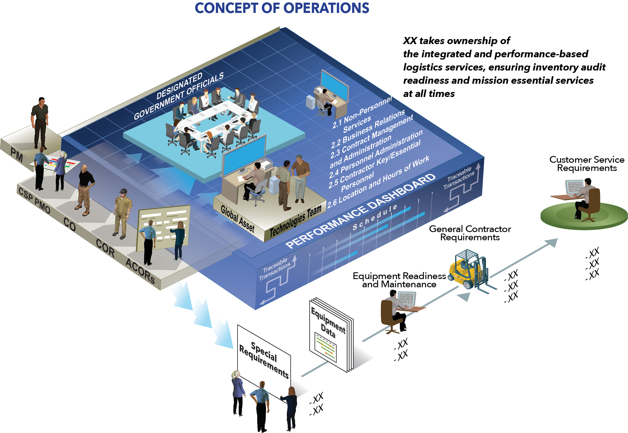
A CONOPS graphic is a great way to quickly give the reviewer an overview of your project methodology.
-
Technical – Using system or process flowcharts can make it easier for a reader to understand highly technical concepts and complex approaches.
-
Past Performance – Try an infographic featuring statistics and metrics from previous contracts, customer quotes, or graphics highlighting success with similar projects or work.
-
Organizational/Management – Use a graphic to show the team's management structure and organization, or to convey detailed processes like those for employee onboarding and retention, or quality control/customer engagement.
-
Win themes and discriminators – Use graphics that highlight your company’s value proposition and answer the question, “Why us?”
So, how do you identify areas within your proposal that could become potential graphics (especially if you didn’t heed the earlier advice to incorporate graphics during the draft process)? The following types of information are great candidates for visual representations:
-
Processes and approaches
-
Lists
-
Comparisons
-
Relationships
Rather than looking at a section and trying to visualize it as a picture, simply look for bullets. Anything that can be written as bullets is a potential graphic, because they often contain a series of steps or a list of examples. Which is more compelling and eye-catching, the bulleted list above or the graphic below?

The brain absorbs visual information 60,000x faster than text.
Conclusion: If used properly, graphics can:
-
Help the reader understand a concept more quickly
-
Motivate readers to dive into the text and find out more
-
Help your proposal stand out from the rest
-
Create a compelling visual story, rather than using a "cookie cutter" approach
Let Trident Proposal Management take the guesswork out of creating compelling content and visuals for your proposals -- our team of experts is ready to help you take your proposal responses to the next level!


